
Clalit is Israel's largest healthcare provider, serving more than 4 million members through a comprehensive digital ecosystem. Its mobile application enables members to conveniently access a wide range of healthcare services, including appointment booking, prescription management, test results, and administrative services.
Understand the business goals, user needs, existing product, and key challenges through research and analysis.
Translate insights into clear problems, requirements, and opportunities that establish the design direction.
Develop and evaluate different ideas, user flows, and interaction patterns to identify the most effective solution.
Turn concepts into intuitive experiences through wireframes, prototypes, visual design, and design systems.
Test the solution with users and stakeholders, identify issues, and iterate to improve usability and effectiveness.
Prepare designs, specs, and docs, and collaborate with developers for accurate implementation.
Based on user interviews, application analysis, and evaluation of existing workflows, the following usability challenges were identified.
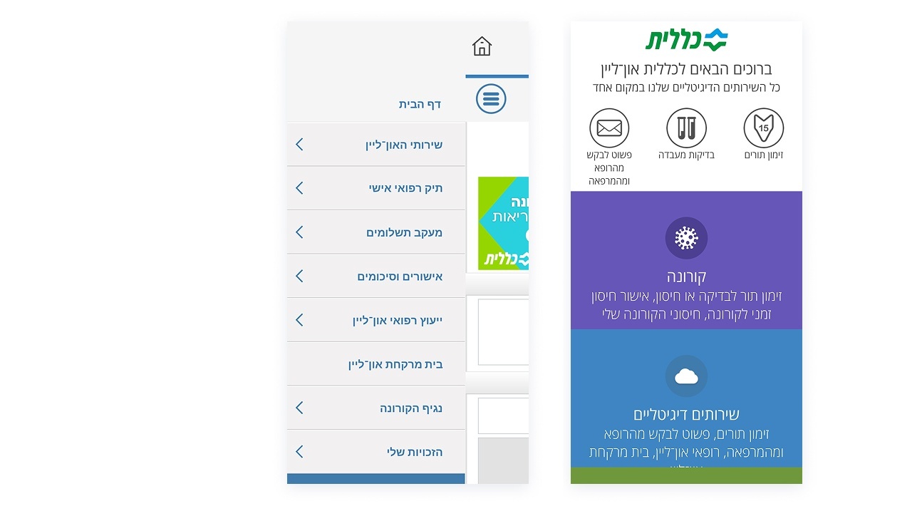
The application presented an outdated visual experience with inconsistent design patterns, affecting usability and user confidence.
Established a modern and cohesive visual language supported by a scalable Design System to ensure consistency across the application.
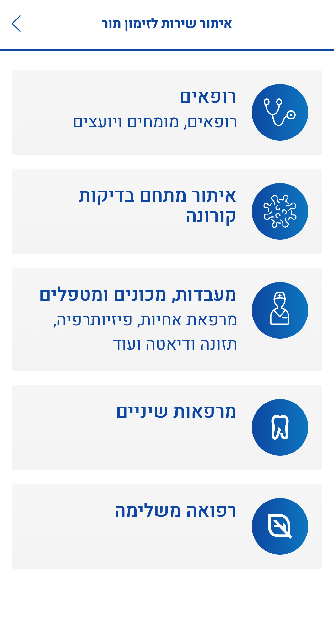
Healthcare services were not structured according to users' expectations, making it difficult to discover and access relevant features.
Restructured healthcare services into intuitive categories aligned with users' mental models to improve discoverability and navigation.
The navigation structure relied on multiple menus, increasing complexity and creating unnecessary cognitive load.
Simplified the information architecture by reorganizing menus and reducing unnecessary complexity.
Important services and information were not sufficiently visible, causing users to miss relevant content and increasing frustration during task completion.
Increased visibility of frequently used services by prioritizing them within the main interface and reducing the effort required to access them.
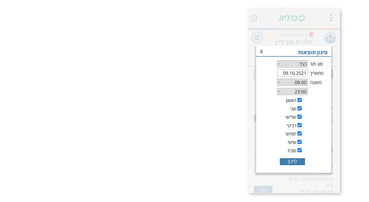
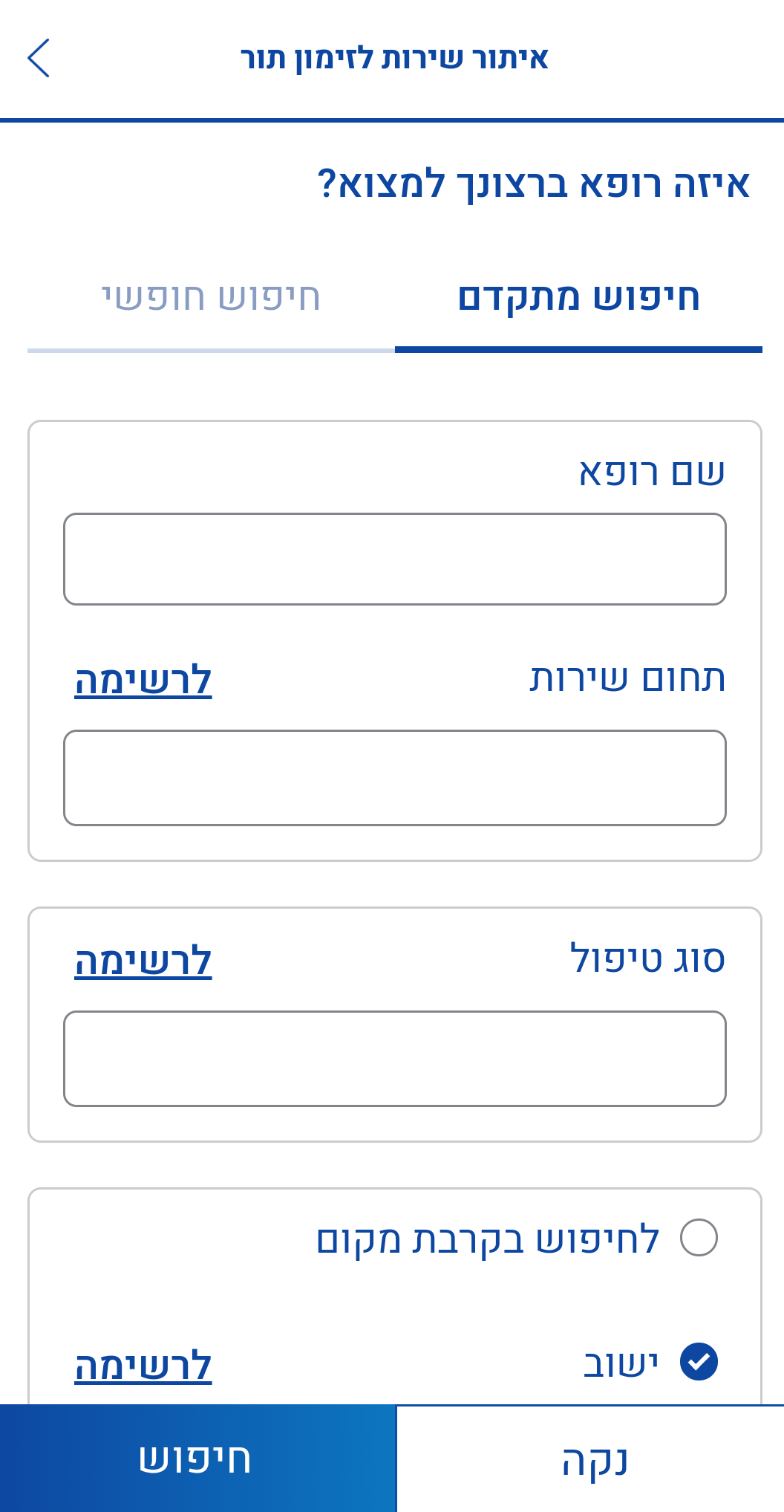
The search and filtering experience was limited, making it challenging for users to efficiently find the right healthcare services.
Enhanced the search and filtering experience to help users find relevant healthcare services faster and more efficiently.
Analyzing the competitors revealed opportunities to simplify navigation, prioritize frequent tasks, and organize complex health information more clearly.
These insights helped shape Clalit’s navigation and service hierarchy.


Which features or services do you use most frequently in the Clalit app?
Are there any features or services you would like to see improved?
Are there any features or services you feel are missing from the app?
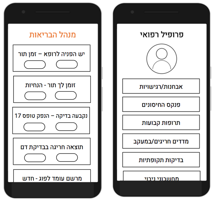
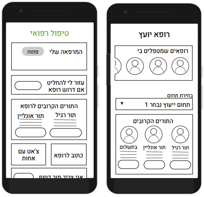
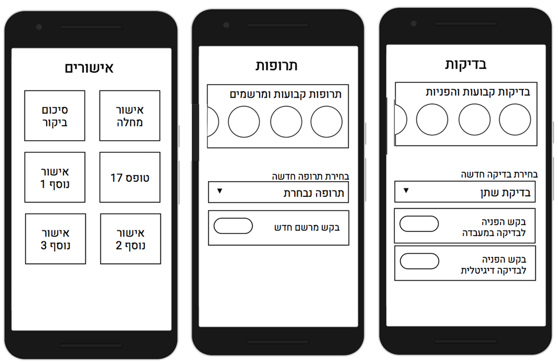
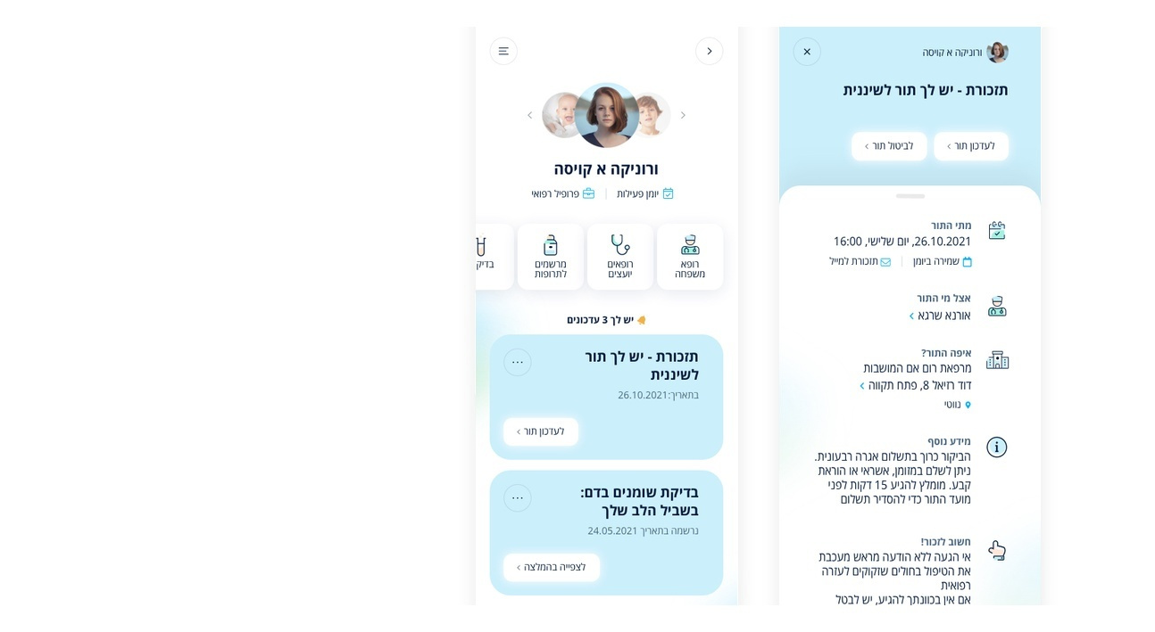
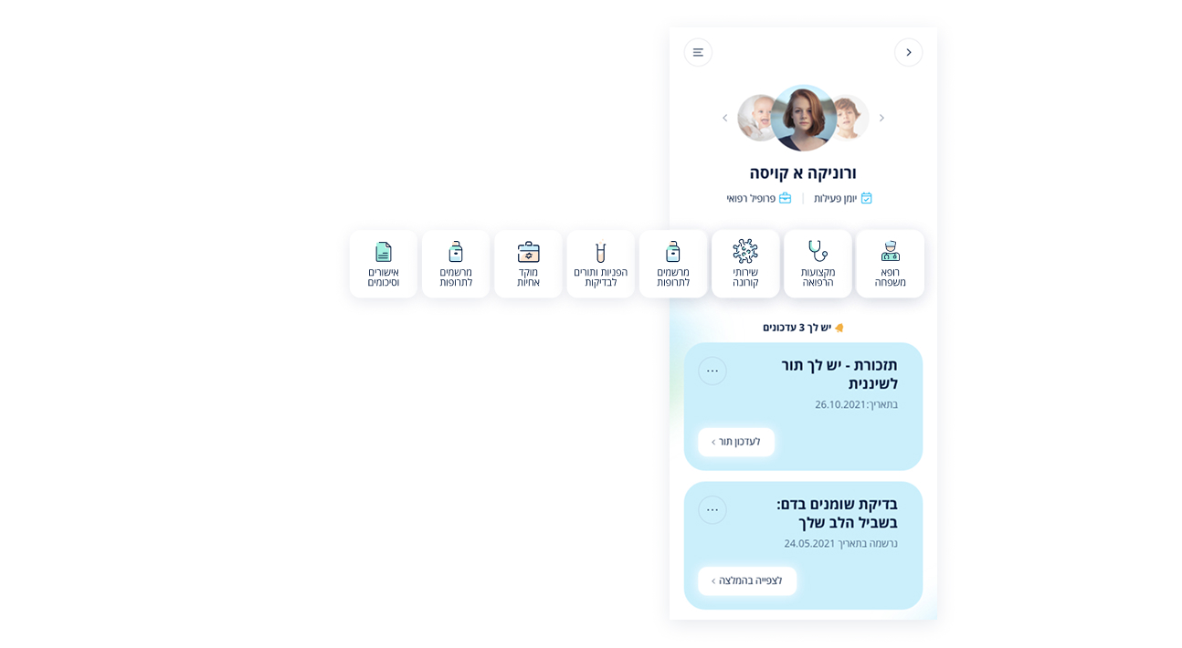
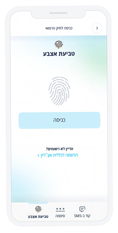
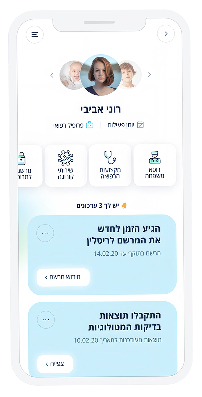
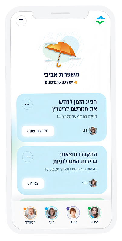
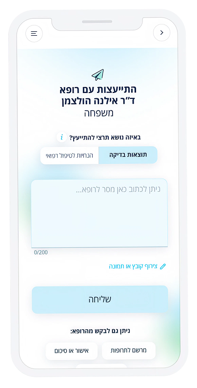
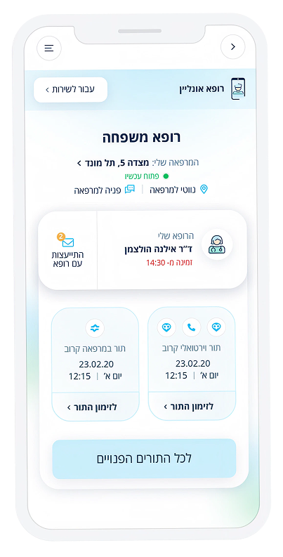
The profile screen and notification components were modernized to improve visual consistency, readability, and information hierarchy.
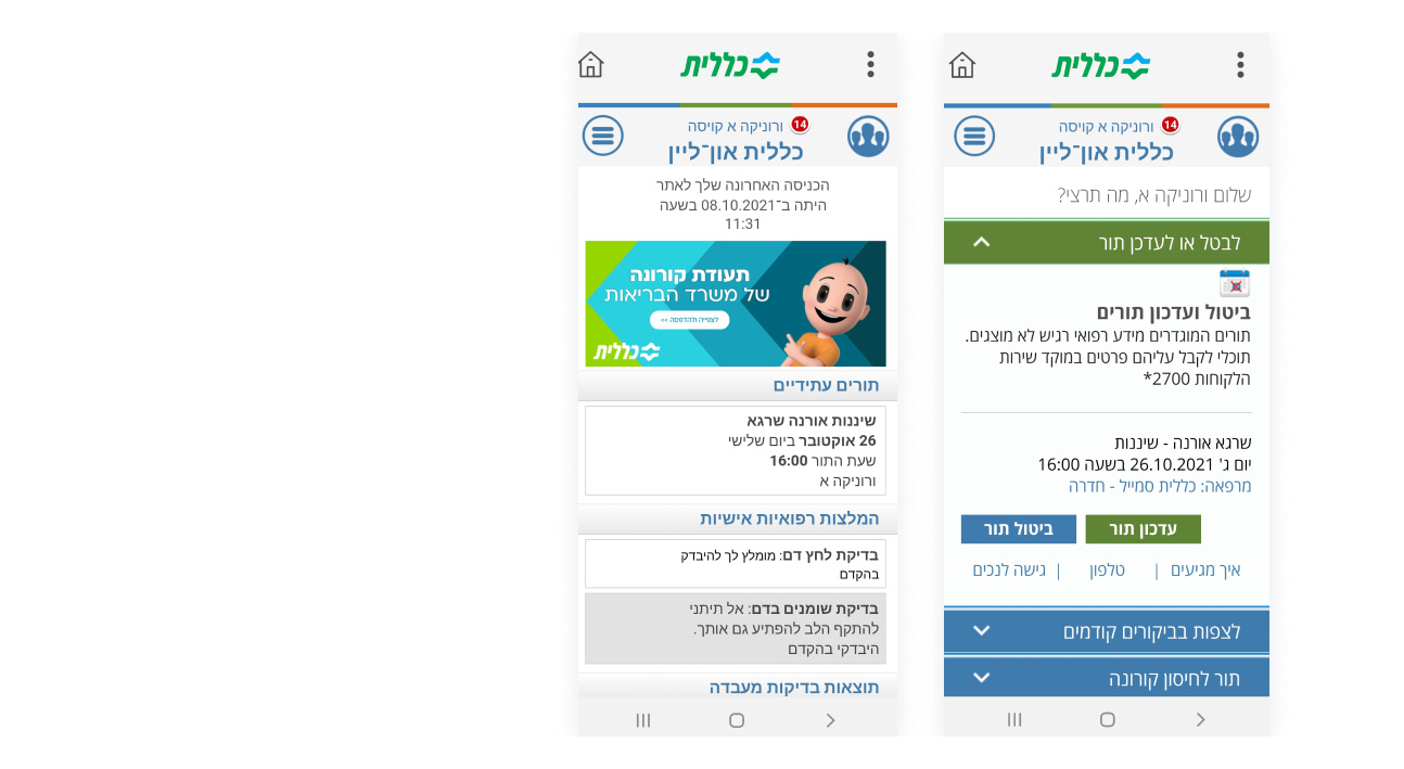
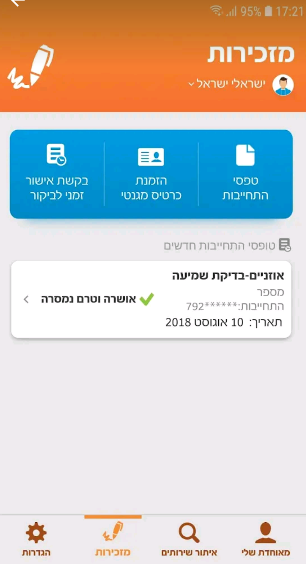
The profile and notification screens had an outdated visual style, weaker information hierarchy, and inconsistent component treatment, making the interface less clear and harder to scan.
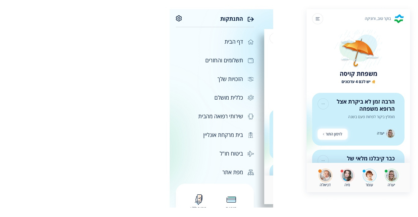
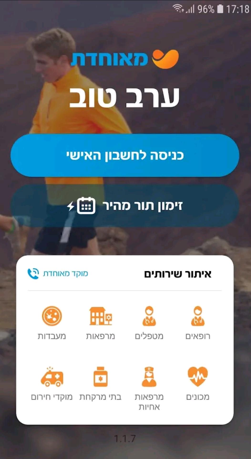
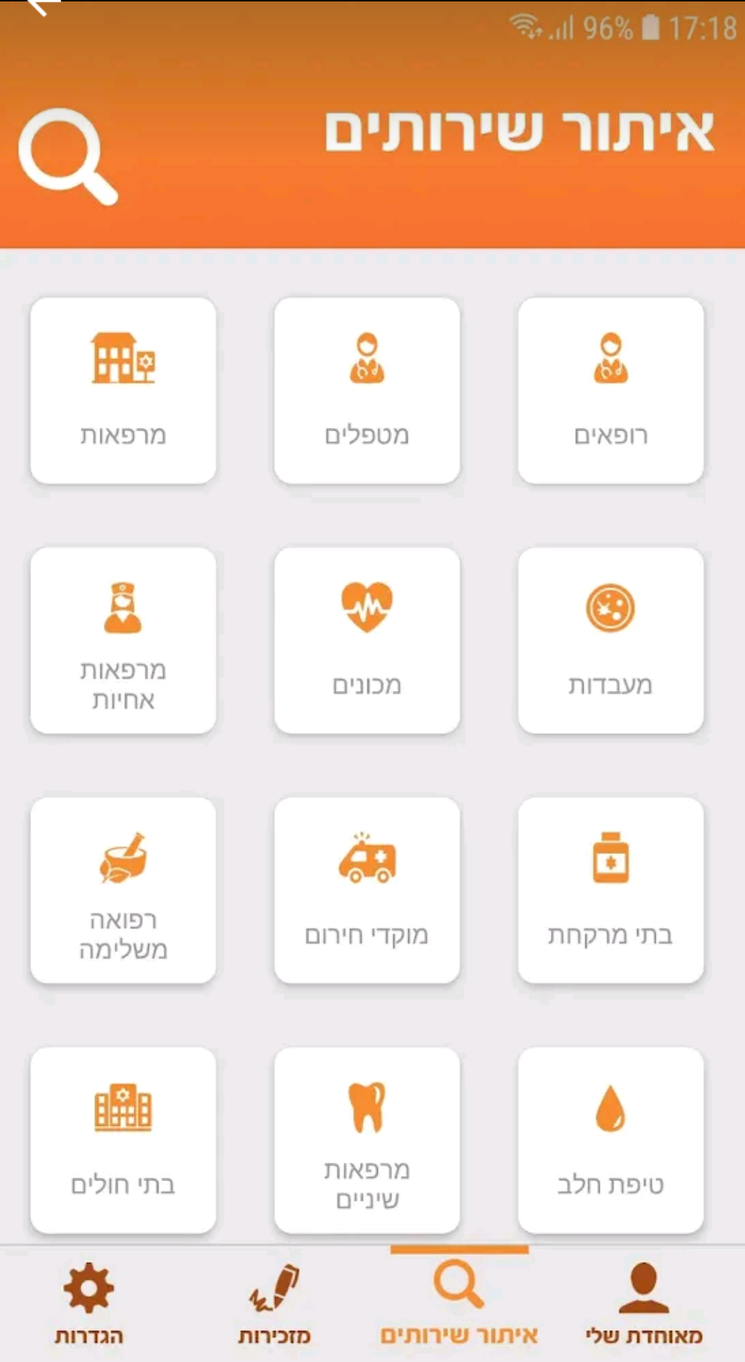
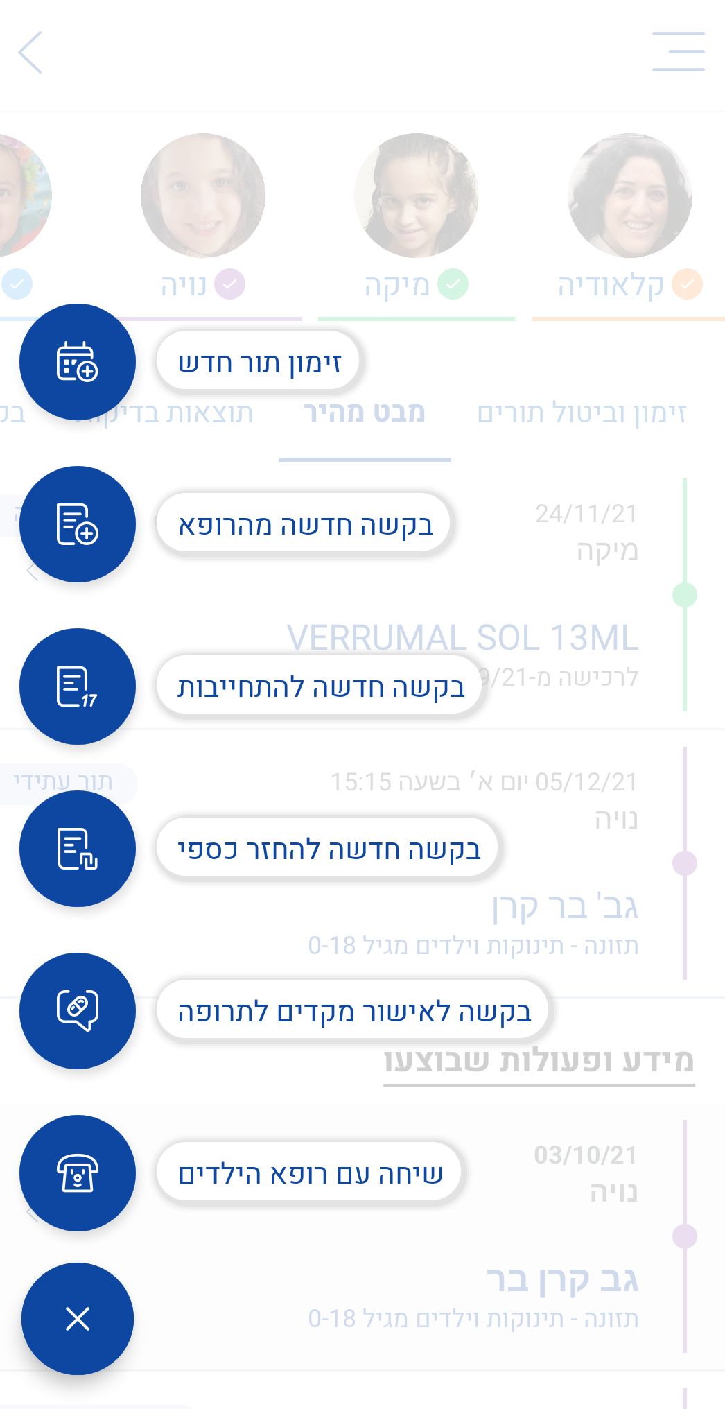
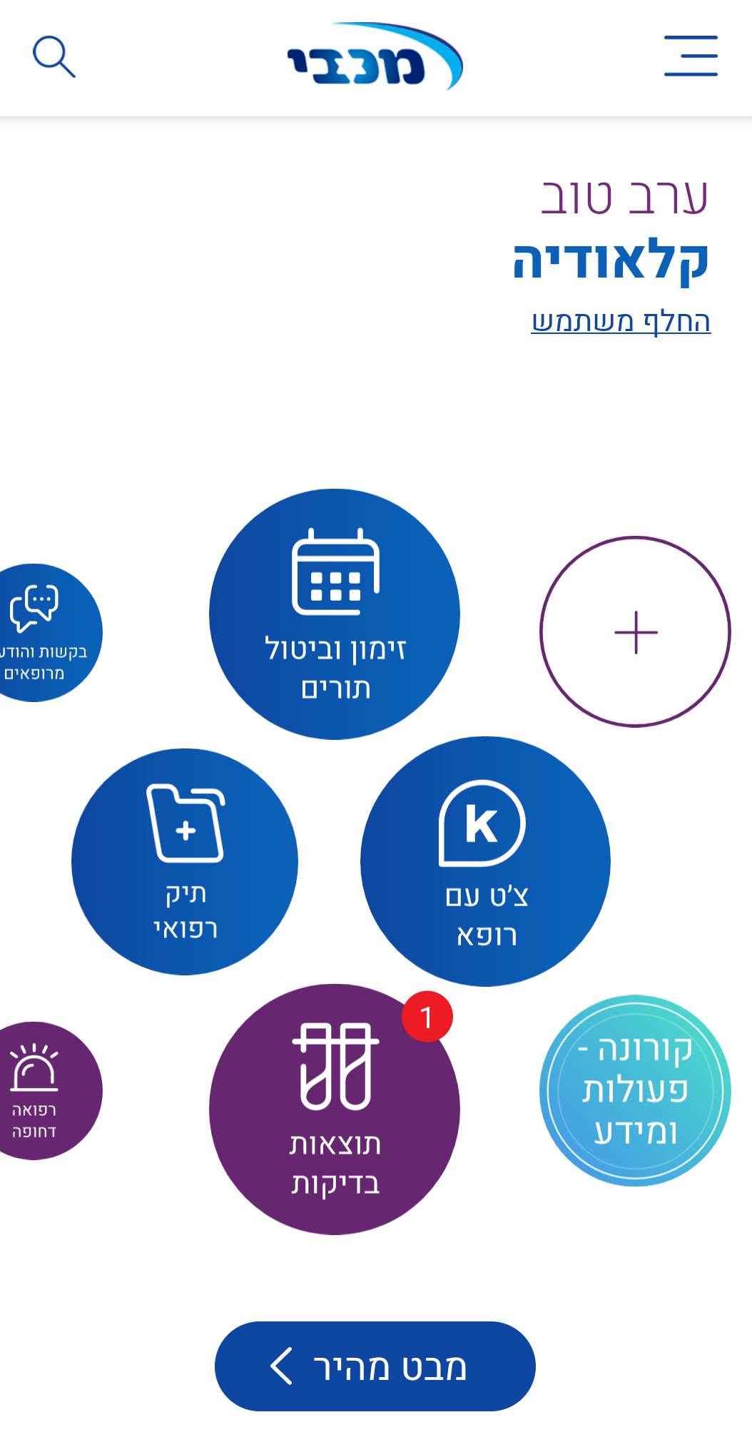
Navigation was consolidated into a single menu, while services were reorganized into intuitive categories, improving information architecture, discoverability, and ease of navigation.
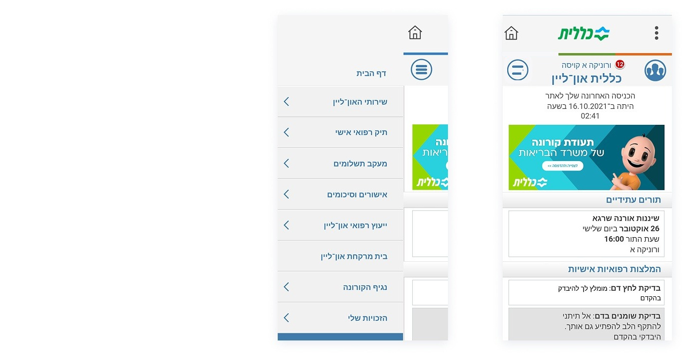
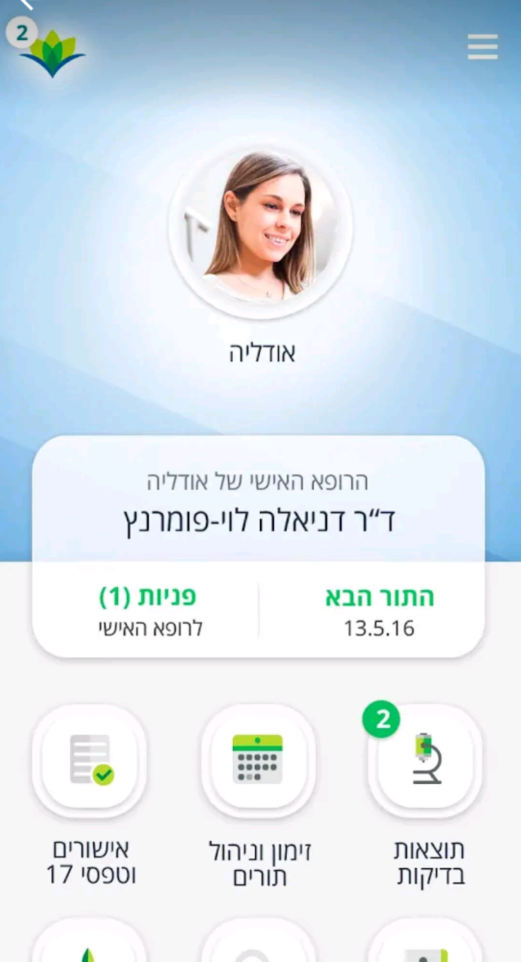
There are four separate menus with overlapping and inconsistently organized functions, making navigation unnecessarily complex.
All digital services are centralized on the home screen, improving visibility and enabling faster, more intuitive access.
Services are duplicated across multiple areas, making them harder to find and creating confusion for users.
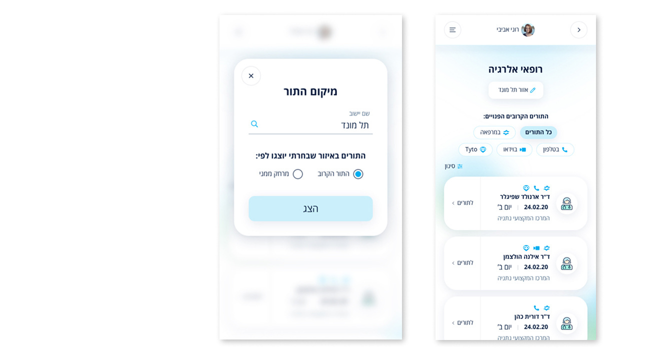
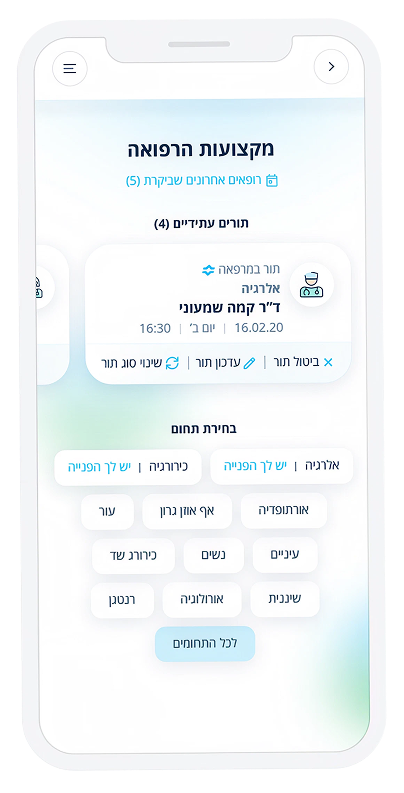
A location filter was introduced, allowing users to refine search criteria dynamically and find available doctors more efficiently.
Users could not modify the location during the doctor search flow, forcing them to restart the process to expand their search area.
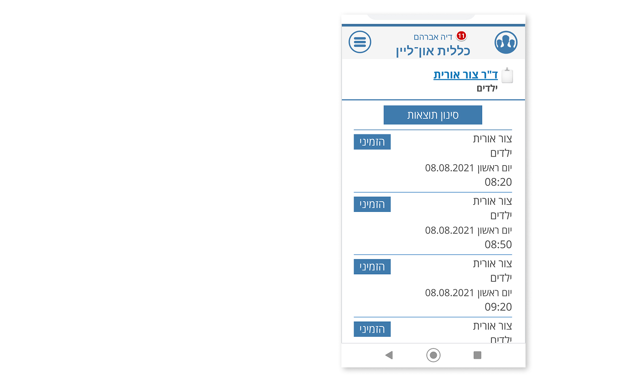
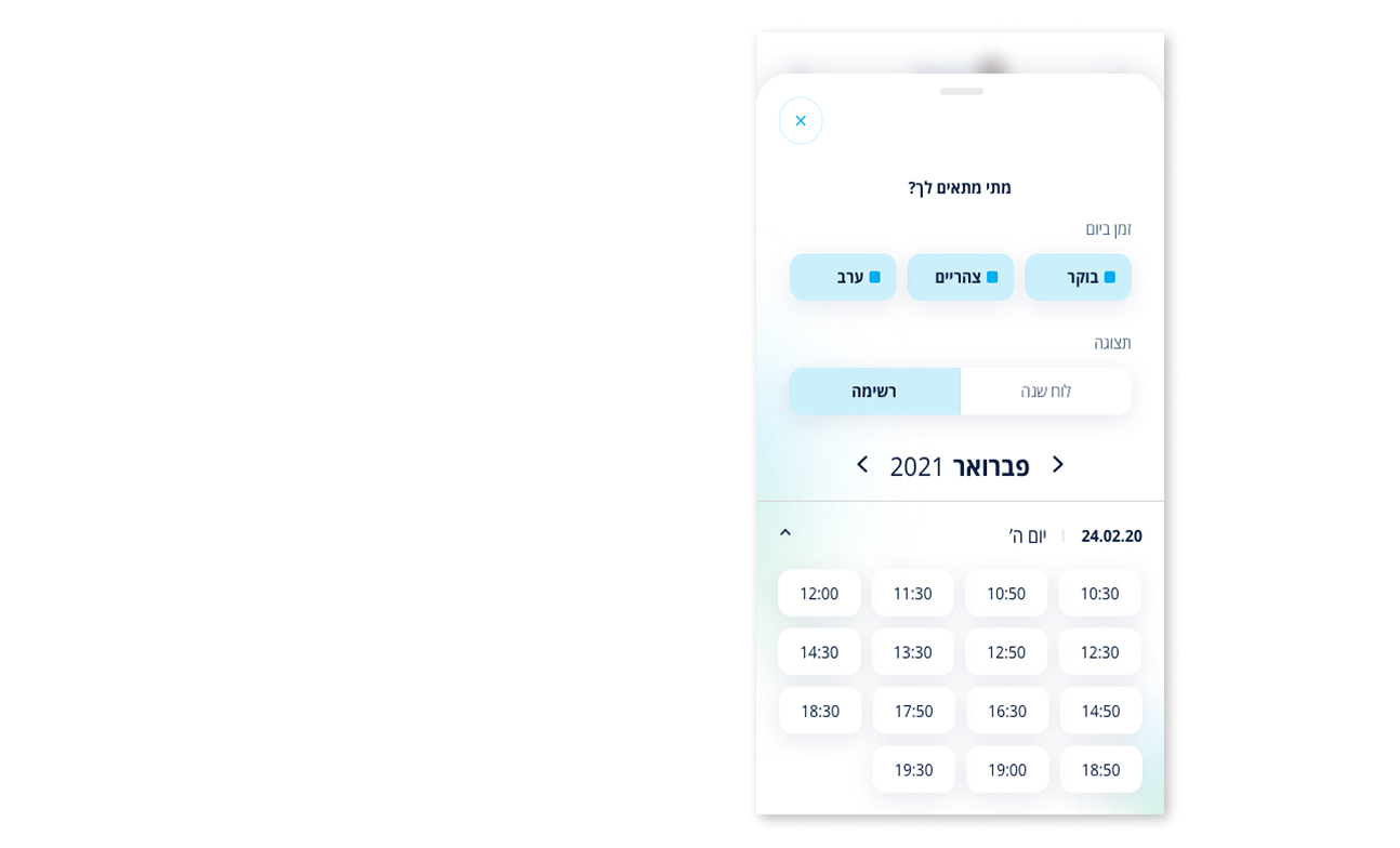
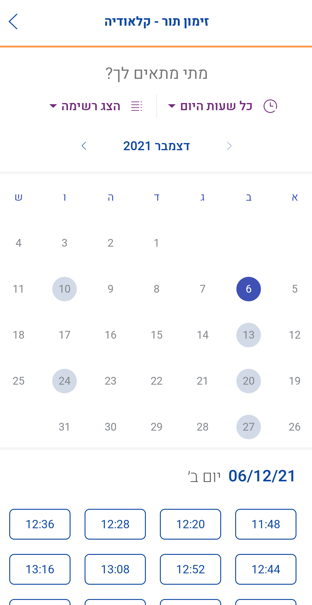
The calendar component enables users to quickly view and select available dates and time slots, improving readability, reducing cognitive load, and streamlining the booking process.
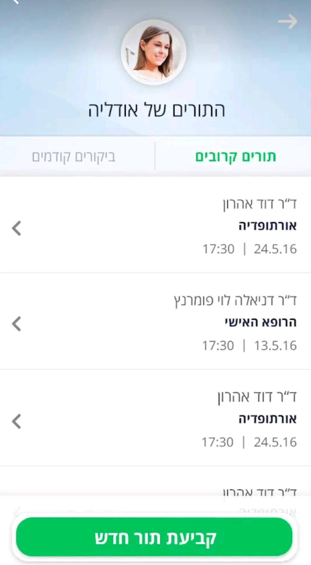
The long list of available appointments creates a confusing and overwhelming user experience.
Usability testing was conducted to evaluate the redesigned experience. Participants were able to navigate the application easily and provided positive feedback regarding the new design direction. The sessions also uncovered additional usability opportunities, helping identify further improvements to enhance efficiency, clarity, and the overall user experience.

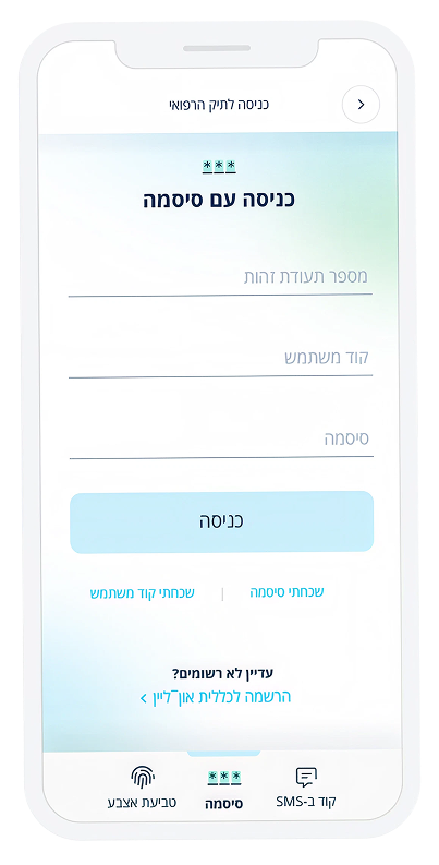
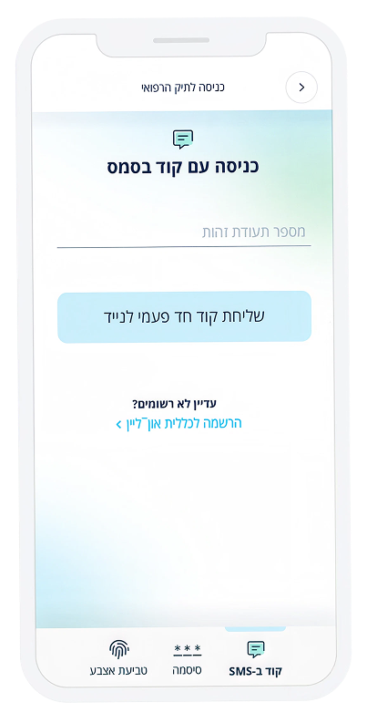
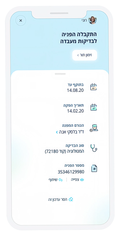
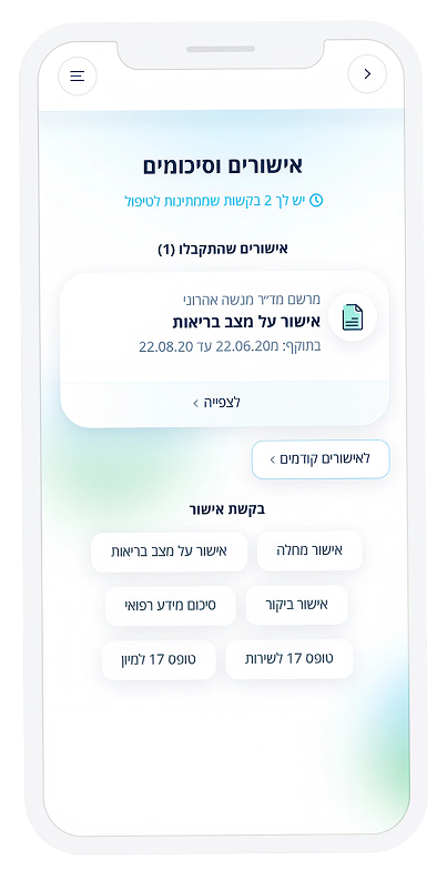
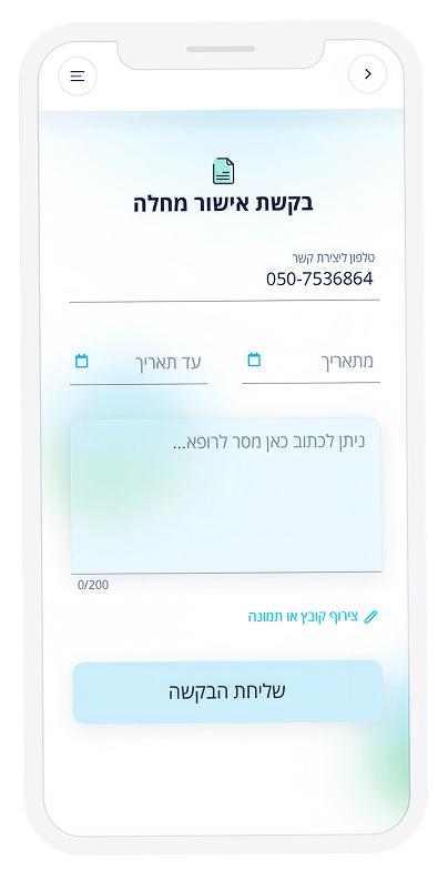
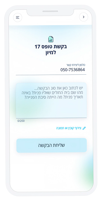
Primary
Blue00AEEF
White—
Darkest Gray061C3F
Dark Gray486683
Middle GrayA3B2C1
Light GrayD1D7DD
Secondary
Light blueCCEFFC
Light greenDBF4E4
Light orangeFDE6D2
Green0DB14B
Validation RedD31715
14 px

18 px

35 px

Special Action

Special check box checked

Special check box unchecked

Special filter outlined

Special filter filled

Special filter outlined with icon

Special filter filled with icon

Special toggle x2

Special toggle x3

Action buttons

Primary no icon

Primary with icon

Action buttons small and top icon

Action buttons with icon

Buttons Menu applications

Appointments

Services – single action

Services – double actions

For Family screen with picture

Doctor communication

Default

Typing

Focused

Filled

Error