
SecondOpinions - B2C Medical Platform

Healthcare E-Commerce Conversion Optimization User Research Responsive Design

SecondOpinions is a healthcare platform that connects patients with medical specialists for remote second opinions. Users can securely upload medical records and imaging studies to receive expert reviews, helping them better understand diagnoses and explore treatment options.

Project Scope

  • Led the end-to-end redesign of the patient journey, from service discovery through medical form submission. Conducted usability evaluations and improved service discoverability and user confidence across desktop and mobile.
Research
UX Design
Wireframes
UI Design
Style Guide
Testing
Engineers Team
Product Managers
Clinical Management
Marketing Dept.
Sales Dept.
01

Discover

Understand the business goals, user needs, existing product, and key challenges through research and analysis.

02

Define

Translate insights into clear problems, requirements, and opportunities that establish the design direction.

03

Explore

Develop and evaluate different ideas, user flows, and interaction patterns to identify the most effective solution.

04

Design

Turn concepts into intuitive experiences through wireframes, prototypes, visual design, and design systems.

05

Validate

Test the solution with users and stakeholders, identify issues, and iterate to improve usability and effectiveness.

06

Hand Off

Prepare designs, specs, and docs, and collaborate with developers for accurate implementation.


The Main Goals

  • Provide an intuitive and user-friendly interface that guides users effortlessly through the process.
  • Simplify navigation with clear menus, calls to action, and streamlined pathways to key services.
  • Identify and eliminate friction points in the user journey that lead to drop-offs.
  • Present information in a clear, concise, and easy-to-understand manner, avoiding medical jargon where possible.
  • Increase website traffic, keep Radiology as the core business, apply AI as an additional service and key differentiator, and ensure desktop and mobile compatibility.

Identify the Problems and Suggest Solutions

Following an analysis of the current website and interviews with key stakeholders, the following conclusions were reached.

Problem
1

The current site does not convey a "clinical website".

Solution
1

Redesign the website with a modern and fresh look, while maintaining the medical appearance to build user/patient confidence.

Problem
2

The site appears to lack confidence.

Solution
2

Remove spammy and generic elements to avoid loss of confidence.

Problem
3

There are a large number of subspecialties that confuse users, causing them doubts regarding which one they have to choose.

Solution
3

Reduce drastically the medical subspecialties quantity (from 76 to 24).

Problem
4

Many irrelevant sections prevent the user from purchasing a second medical opinion service.

Solution
4

Focus on specific (paying) audiences, build the flow for their needs, and remove other, non-relevant sections that can confuse the patients/users.

Problem
5

Poorly applied user experience practices in some components.

Solution
5

Present information in a clear, concise, and easy-to-understand manner, avoiding medical jargon where possible.

Site Architecture

The irrelevant pages were removed, and the navigation was improved.
Home
4 Most popular Services
How it works
Why choose us
FAQ
Contact us
Our Services
Most popular Services
Medical Specialties
Surgical Specialties
About Us
Our Mission
Why choose us
Who we are
FAQ
General Second Opinions
Radiology Second Opinions
Communication with the Doctor
Technical assistance
Artificial Intelligence
Blog
How it works

New Website Design

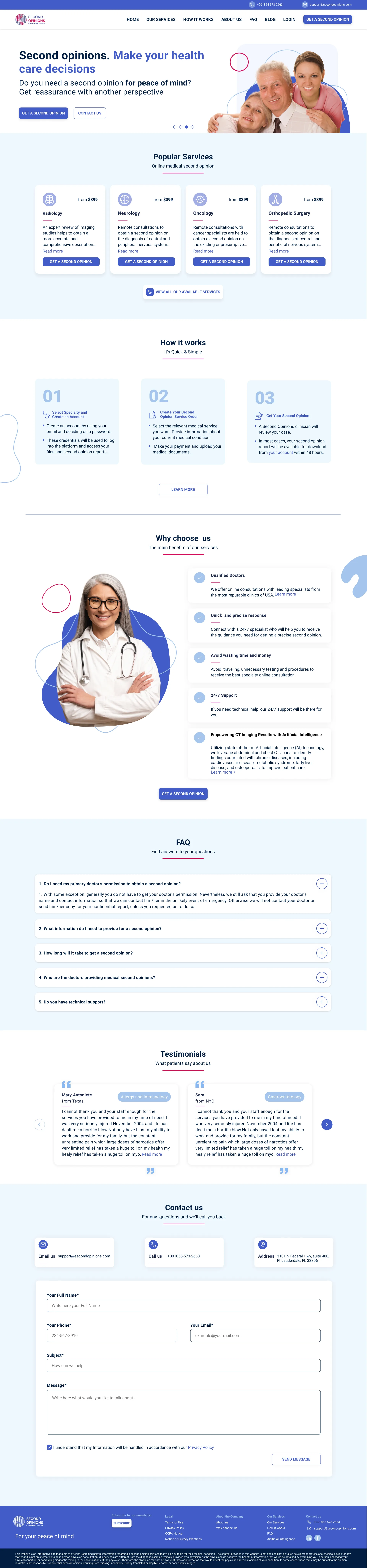
New SecondOpinions website design on desktop
New SecondOpinions website design on mobile

Before and After

Home Page

SecondOpinions website navigation SecondOpinions popular services section

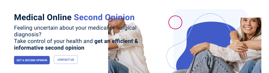
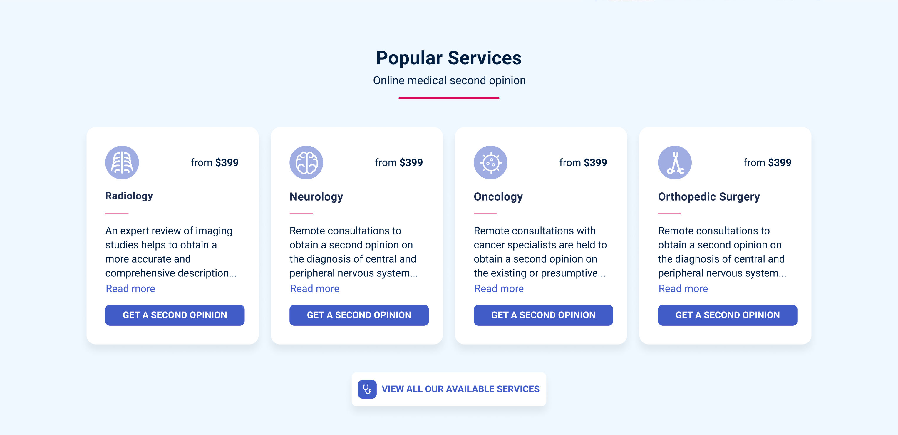
The homepage hero includes a four-image carousel that clearly communicates the site’s vision and purpose.

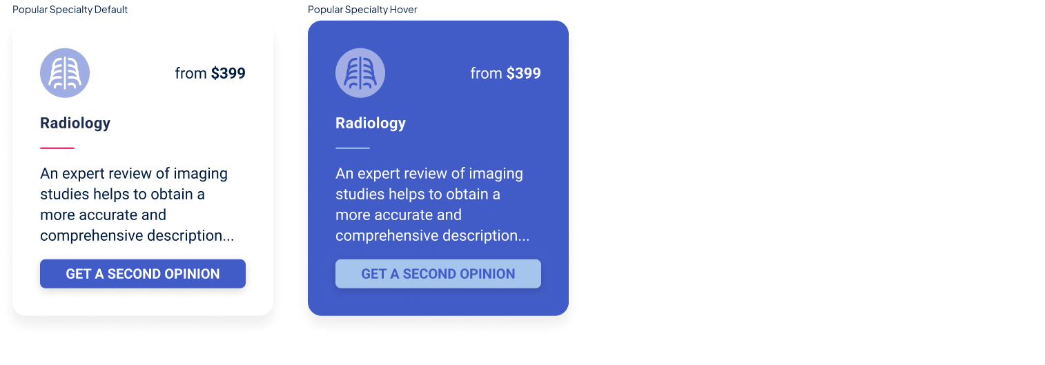
This section highlights the most frequently selected medical services based on analytics data, improving discoverability and aligning the experience with user demand.

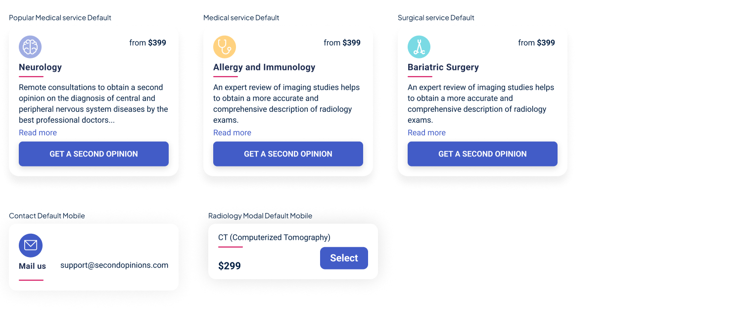
Each Medical Service is presented as an individual card with a concise, user-friendly description to help users understand and choose the right service. “Read more” leads to a detailed page, while “Get a Second Opinion” takes users directly to the medical request form.

The text across the four carousel slides is crafted around the website’s core messaging, using short, relevant, and effective copy to communicate the spirit and value of the service.

The primary and secondary buttons are clear and intuitive, guiding users toward the main objectives and relevant actions.

By default, only the most frequently selected medical services are displayed. Users can click “VIEW ALL OUR AVAILABLE SERVICES” to explore all available medical services.

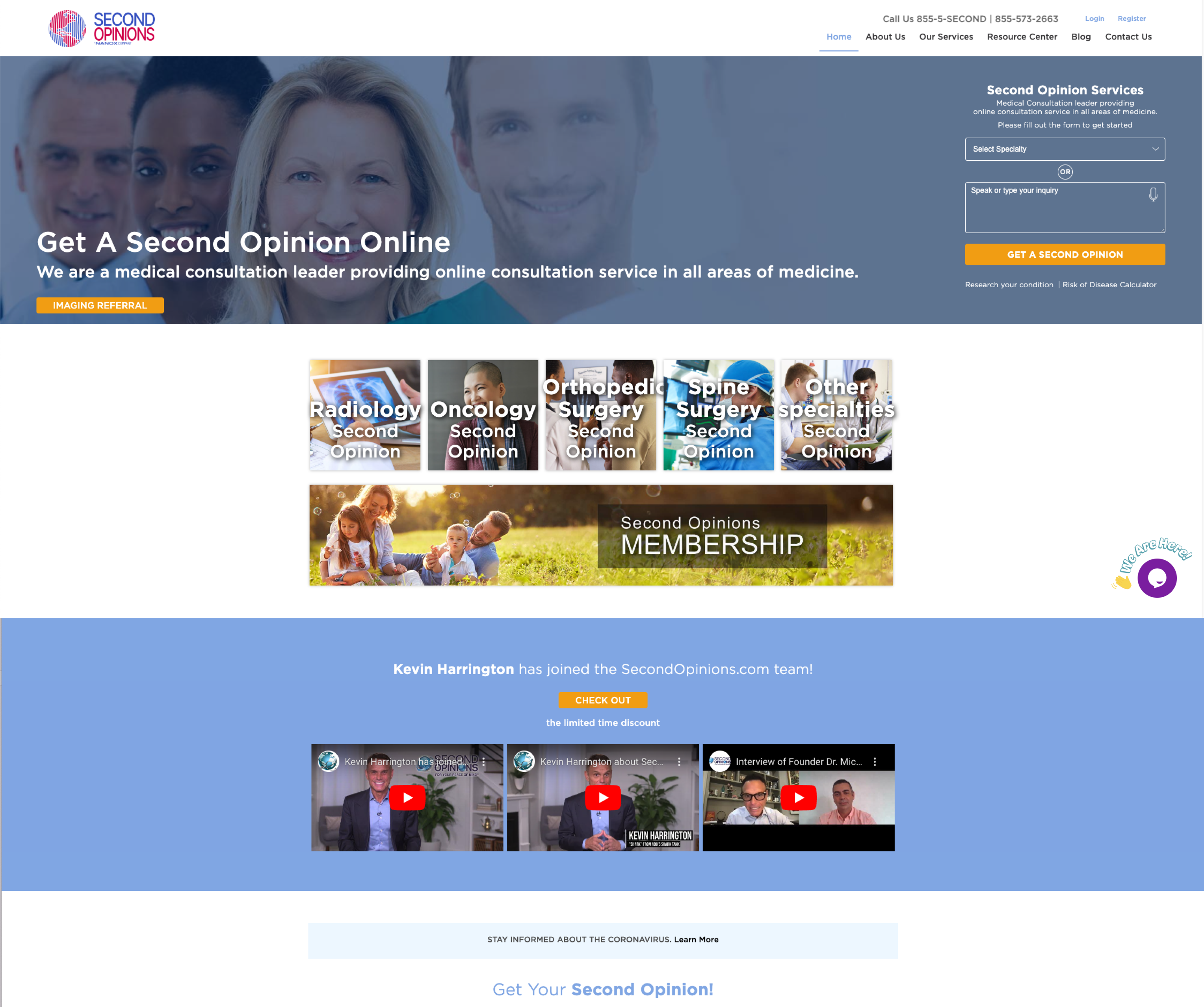
Before: old SecondOpinions website design

Users did not find the hero section engaging, indicating that it neither clearly communicated the product’s value proposition nor encouraged users to progress toward purchase.

Users were unsure of the CTA button’s purpose, and the label “Image Reference” created confusion, making it difficult to understand the expected action.

The visual appearance of the components lacked refinement and did not meet users’ expectations for a professional product experience.

The Medical Services cards looked outdated and were difficult to understand. The design lacked a clear visual hierarchy and did not provide enough context or guidance to help users understand the different services and choose the one that best fit their needs.

These spammy and generic elements were poorly organized and lacked a clear hierarchy, creating more confusion than clarity. They made it difficult for users to understand the site’s message and purpose, while also making the overall experience feel unprofessional.

Radiology Internal Page

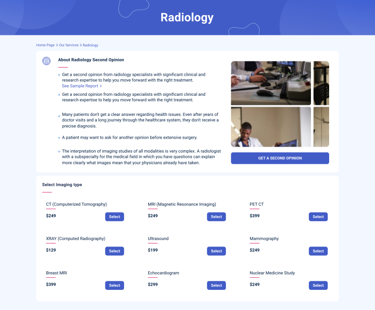
After: new SecondOpinions radiology internal page design

A breadcrumb improves navigation, helping users understand where they are within the site and easily return to the Medical Services list.

A doctor’s image makes the medical service explanation feel more human, professional, and aligned with the medical nature of the service.

All internal Medical Services pages are redesigned with updated content that provides a more detailed explanation of each service, including examples of the final report patients receive.

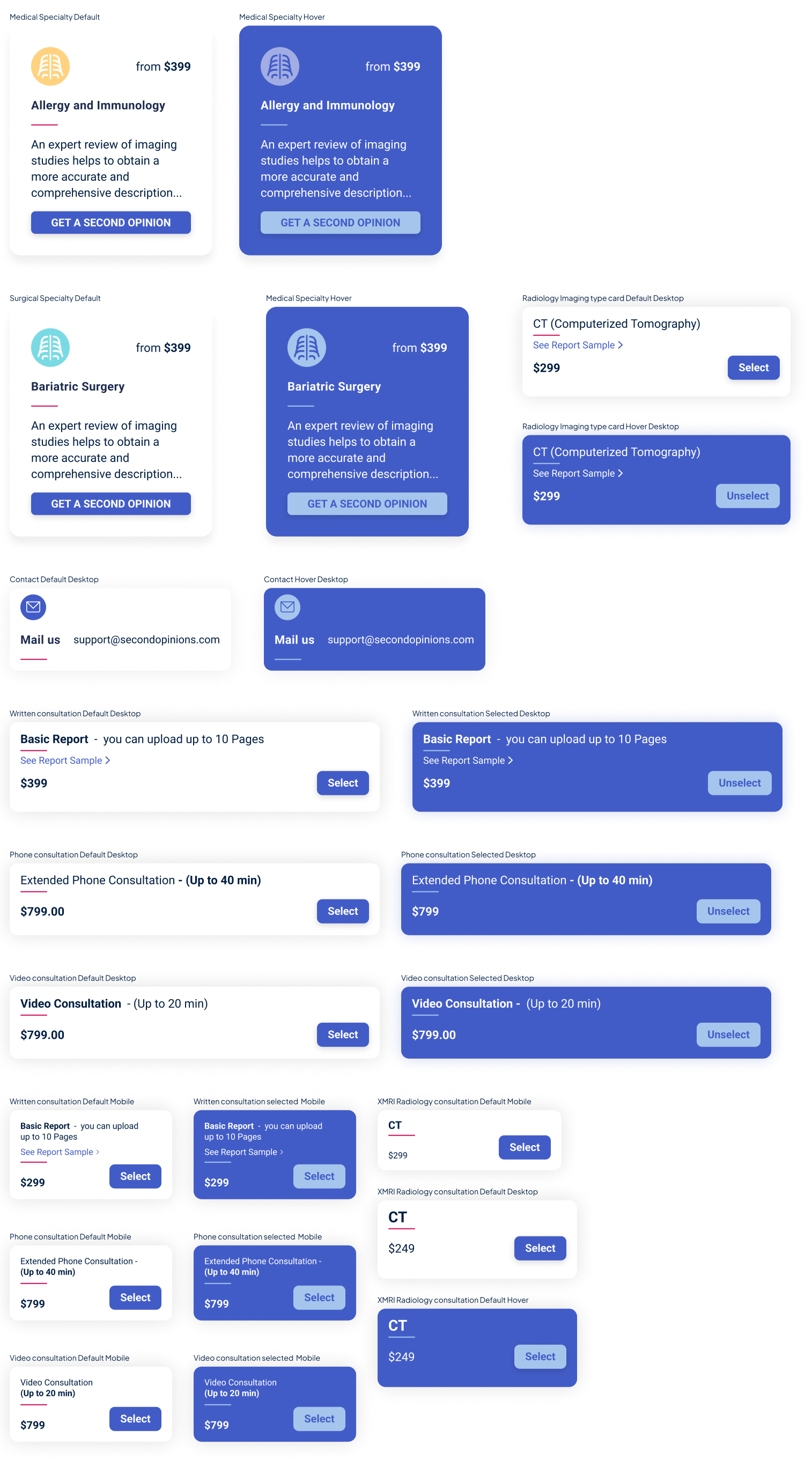
The new modality card design builds user confidence by presenting each option in a clear, structured, and professional way, making the available services easier to understand and compare.

Before: old SecondOpinions radiology internal page design

The explanation about “Radiology” was not relevant. It should have explained the Radiology Second Opinion service instead.

Users found the Internal Medical Services page difficult to understand due to insufficient context and a lack of clear explanatory content.

The modality options were presented in an outdated way, which could undermine user confidence in the service. In addition, the “Order Now” label felt overly aggressive and unprofessional, and did not align with the medical nature and tone of the site.

Medical Form

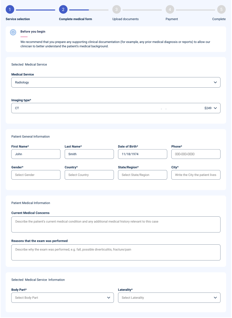
After: new SecondOpinions medical form design

The Medical Form features a clean, modern design with clear visual hierarchy, supporting ease of use and readability.

The selected service is clearly presented along with the pricing, promoting transparency and building user confidence.

The microcopy is refined for clarity, keeping only relevant questions to streamline the experience.

Patient metadata is pre-filled in the form, saving users time and reducing the need for manual data entry.

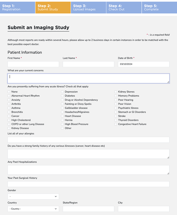
Before: old SecondOpinions medical form design

The visual design felt outdated, which negatively impacted users’ perception of the product’s modernity and overall quality.

The Medical Conditions list was overly long, with no clear ordering or prioritization of options, making it difficult for users to navigate and find the relevant condition.

All required information was displayed randomly under a single “Patient Information” category, making it difficult for users to scan and complete the form efficiently.

The questions were phrased inconsistently and lacked clarity, leading to confusion in user interpretation.


Prototypes


Reflection & Impact

The metrics below reflect the first six months following launch, compared against the platform's performance prior to the redesign.

0%

Booking Tasks Completed

+0%

Increase in Website Traffic

−100%

Visitor Drop-Off Before Purchase

100%

Less Time Managing Orders

+0%

Increase in Second Opinion Orders

0%

Orders Completed Without Support


Design System

Colors

Primary

Dark blue011E41

Blue425CC7

SkyA5C5ED

Red USARADD30B59

White—

Secondary

Light grayD8D8D8

Dark gray757575

Light blueF3F7FF

Super Light blueCADBEE

Light YellowFED280

Light Turquoise7ADAE4

Light VioletA0ADE3

Green1A932E

Light RedEFE1E1

Red ValidationD24B4B

Light GreenDDE9DF

Icons

8px

Design System – 8px icons

10px

Design System – 10px icons

14px

Design System – 14px icons

20px

Design System – 20px icons

26px

Design System – 26px icons

30px

34px

Design System – 34px icons

40px

Design System – 40px icons

48px

Credit Cards

Desktop

Mobile

Design System – Credit card badges

Buttons

Basic without icon – Desktop

Ghost without icon – Desktop

Design System – Basic and Ghost buttons, Desktop

With icon – Desktop

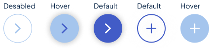
Design System – Buttons with icon, Desktop